Reimagining the BET Awards - A Celebration of Black Excellence
2021
Client
BET Networks
Background
In 2021, BET entrusted me with a significant task: to help lead the creative direction and development of the visual identity for the BET Awards. This wasn’t merely a design project; it was an opportunity to reimagine the BET brand with a fresh, engaging vision that would debut during the highly anticipated awards show. My role was comprehensive, encompassing the creation of the look and tone, writing and directing the promotional content, and orchestrating the brand refresh that would captivate millions on the night of the event.

Objectives
Craft a Unique Visual Identity: Develop a new, cohesive look and feel that reflects the essence of BET and resonates deeply with its audience.
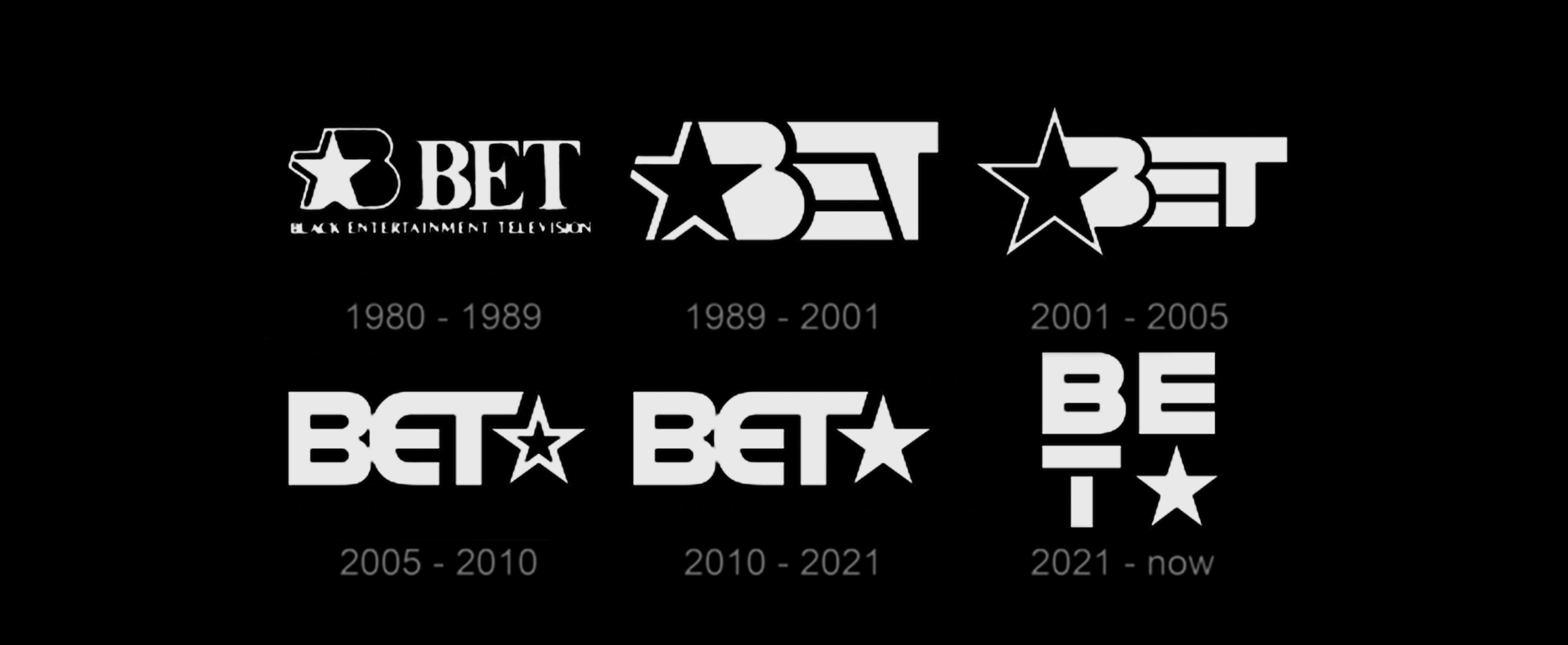
Brand Refresh: Implement a comprehensive rebrand of BET Network, highlighted by the introduction of the new “square” logo.
Promo Campaign: Write and direct a series of captivating promos to build excitement and anticipation leading up to the BET Awards.

The Concept: A Canvas for Black Creativity
Central to our creative vision was the “square” logo, a symbol of boundless possibilities and a blank, Black canvas where anything can happen. This visual metaphor became the cornerstone of our rebranding efforts, positioning BET as the ultimate hub for Black creators, visionaries, and talent.
• Versatility of the Square: The square logo is dynamic and fluid, expanding and contracting to represent the diverse spectrum of Black creative expression. It symbolizes the epicenter of Black culture, a space where every form of art and creativity can thrive.
• Dynamic Design System: I worked with a team to develop a design system that was intentionally vast and adaptable, allowing for multiple visual styles and motifs. This flexibility ensured that BET could adjust the visual intensity to match the moment’s demands, making the brand evergreen and ever-evolving.
Execution
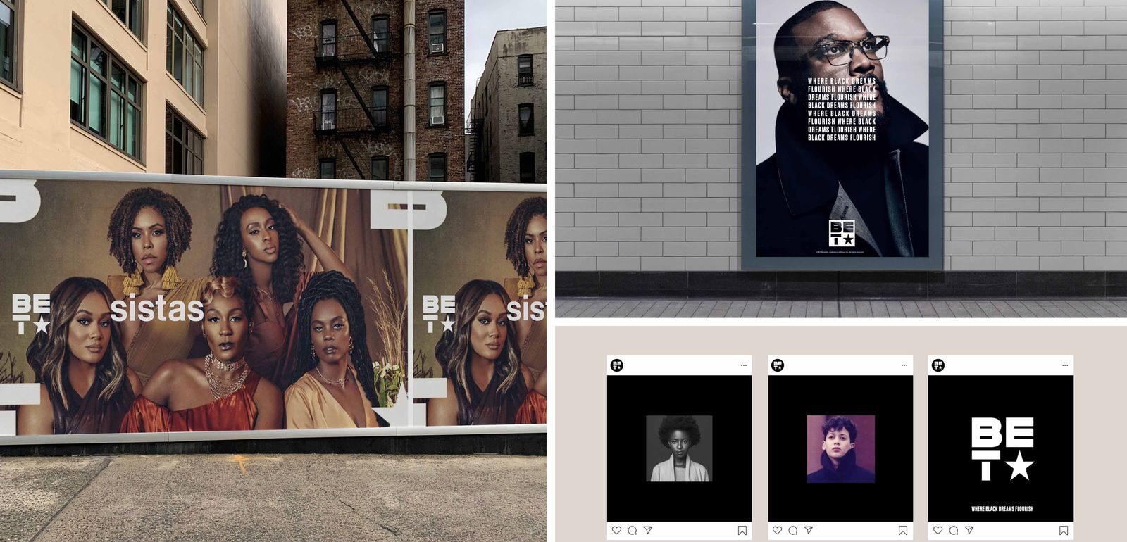
1. Visual Identity Development: Leading a talented team of designers and creatives, we crafted a cohesive visual identity that was both striking and adaptable. This new look was applied across all touchpoints, from on-air graphics to social media content, ensuring a consistent and memorable brand presence.
2. Promo Campaign: Writing and directing a series of high-energy promos that captured the spirit of the BET Awards and the new brand ethos. These promos featured influential Black artists and creators, under the theme “It all happens here.” Each promo celebrated Black excellence, creativity, and innovation, reinforcing BET’s renewed commitment to championing Black culture.
3. Launch Event: The culmination of our efforts was the live broadcast of the BET Awards, where the new brand identity was unveiled to millions of viewers. The event was a visual spectacle, seamlessly integrating the new design elements and affirming BET’s position as a cultural leader.
Redesigned Logo


On-Air Logo

Ticker

Website Mockup


Impact
• Increased Engagement: The rebranding campaign generated significant buzz, leading to a marked increase in viewer engagement and social media interactions.
• Positive Reception: The new visual identity and promotional content received widespread acclaim from both the audience and industry insiders, highlighting BET’s renewed commitment to championing Black creativity.
• Brand Evolution: The flexible design system we implemented allowed BET to continuously evolve its visual style, ensuring long-term relevance and appeal.
Conclusion
As co-creative director, I led a talented team in successfully redefining the visual and creative narrative of the BET Awards, aligning it with the broader brand refresh. The introduction of the “square” logo as a symbol of Black creative expression solidified BET’s role as a cultural epicenter. This project not only elevated the BET Awards but also set a new standard for how brands can celebrate and amplify diverse voices.


